Visualization of Conflicts in Colombia and the World
The Uppsala Conflict Data Program (UCDP) has recorded ongoing violent conflicts since the 1970s. Using its dataset of 135 thousand records of organized violence globally since 1989, we can evaluate the distribution of conflicts in the world and in specific countries.
I listed here the top 10 countries:
Since the year 2000, there are 98K records in the dataset. Again, the top 10 are:
As we can see, the distribution of conflicts is highly skewed to the right since most countries are peaceful and conflicts are concentrated in certain areas of the world. In a recent working paper, we focus on the organized violence in Colombia. Applying a similar methodology to airport score, I count the number of conflicts within 50 km around each point on the map and create a measurement named conflict score.


Another visualization using 3D column:


Both Excel and R are slow in running this amount of data (500,000 records). Shall further investigate other options.

I listed here the top 10 countries:
| Order | Country | Freq |
| 1 | Afghanistan | 22,726 |
| 2 | India | 14,465 |
| 3 | Iraq | 6,488 |
| 4 | Nepal | 5,652 |
| 5 | Pakistan | 5,528 |
| 6 | Turkey | 4,826 |
| 7 | Sri Lanka | 4,576 |
| 8 | Colombia | 4,562 |
| 9 | Algeria | 4,098 |
| 10 | Somalia | 4,090 |
Since the year 2000, there are 98K records in the dataset. Again, the top 10 are:
| Country | Freq | |
| 1 | Afghanistan | 20,980 |
| 2 | India | 11,409 |
| 3 | Iraq | 6,109 |
| 4 | Pakistan | 5,335 |
| 5 | Nepal | 5,084 |
| 6 | Somalia | 3,664 |
| 7 | Colombia | 3,302 |
| 8 | Russia | 3,115 |
| 9 | Nigeria | 2,901 |
| 10 | Sri Lanka | 2,583 |
As we can see, the distribution of conflicts is highly skewed to the right since most countries are peaceful and conflicts are concentrated in certain areas of the world. In a recent working paper, we focus on the organized violence in Colombia. Applying a similar methodology to airport score, I count the number of conflicts within 50 km around each point on the map and create a measurement named conflict score.
Top 10 cities ranked by conflicts score for Colombia and the World

Visualization of conflicts in Colombia and main cities using heat map:

Another visualization using 3D column:

Animation

Both Excel and R are slow in running this amount of data (500,000 records). Shall further investigate other options.
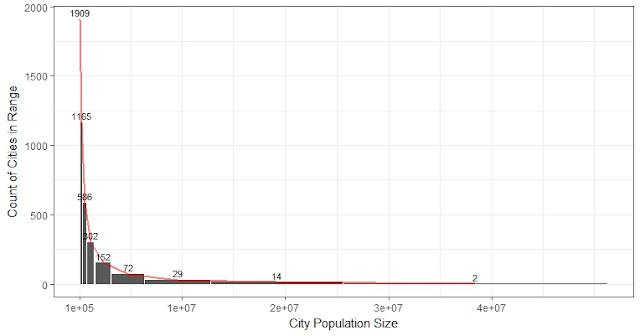
Heat map of conflict region in the world for the 4231 cities
red: cities with at least one conflict; blue: cities with no conflict (2000 - 2015)


Comments