How to Draw Heatmap with Colorful Dendrogram
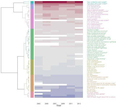
Heatmap with Dendrogram: Color Branches and Labels This data visualization example include: * Hierarchical clustering, dendrogram, and heat map based on normalized odds ratios * The dendrogram was built separately to give color to dendrogram’s branches/labels based on clusters using dendextend * Heatmap is made by heatmap.2 from gplots using the built dendrogram * The rows are sorted by means from highest to lowest, it can be done in either the dendrogram or the heatmap.2 * Use color palettes from colorspace Data YRBSS (Youth Risk Behavior Surveillance System) survey data from CDC. This example plots the odds ratios of 63 behavioral questions on one question regarding disordered eating. The odds ratios are median centered by column and log2 transformed Version 1: Color both the branches and labels library (curl) # read file from google drive library (gplots) # heatmap.2 library (dendextend) # make and color ...