Posts

Showing posts from February, 2018

Survey data analysis using SAS

Image
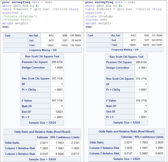
Notes on analyzing survey data using SAS Work a lot on the survey data this week. It turns out that when using statistical package for survey data, it is critical to include all the three variables: clusters (PSU), strata, and weights. But the difference is smaller if without the cluster and strata information. *** *** For example, These two procedures in SAS (both w/o weights) will produce the same contingency table (frequency count) and thus same odds ratio (since it is calculated from frequency). The confidence intervals around OR are slightly different. proc freq data = new; table PCAbove5 * qn26_Sad  /relrisk chisq nopercent ;  run; proc surveyfreq data = new; table PCAbove5 * qn26_Sad  /relrisk chisq nopercent ;  strata stratum; cluster PSU; run; If weights are added to both procedures, we can get the same weighted frequency and OR. The OR is different from the unweighted OR. The confidence interval around OR gets wider. *** *** The difference between using

City population, growth rate, and income (GDP per capita)

Image
What the scatterplots can tell  These two scatterplots are messy at first glance, but the more I look at them the more stories I could see. Of course, maybe these findings can be illustrated separately in better ways. #1. City GDP per capita vs Log City Population Size City population has been put on log scale since it is too skewed. Without log (as in the 3D illustration below) all the cities are clustered on the left except the very large cities. The observations are: The first observation is that there is no pattern in the data points, meaning GDP per capita in the world correlates very weakly with the size of the city.  All the cities in the more developed regions (marked as triangles) are on the top. This is not surprising as the y-axis is income level (GDP per capita). What is interesting is that the distributions of population size for the developed region and developing region seem very close.  There is a natural stratification by the 8 geological regions. This i

Logistic regression using YRBSS data: the 2nd example discussing being sad or depressed

Image
(Compared to the last post on risk to attempt suicide, the main difference is that the interaction effect is not significant.) The hypothesis is:  Are the sexual minority (LGBT) kids who use the computer more often (meaning > 5 hours), more likely to be sad or depressed?  Again, this question is an incomplete one. The big picture in front: why >5 hours is a reasonable break.  For all the kids, do kids who use PC more than __ hours more likely to be depressed than kids who use PC less than such hours?  2 hours or 3 hours are not significant. 4 hours is weakly significant, 5 hours is significant. OR =  1.63 (1.44 – 1.84).  41% of all the kids use PC more than 5 hours, which is a large enough amount. I see no reason to go into the more detailed breakdowns within 5 hours. 8% of all the kids belong to the LBGT group. Since there are 13,862 kids in total, 8% represents about 1,145 kids.  In the LGBT group, 52% use PC more often, while in the majority group, 40% use PC

Logistic regression can be equivalent to contingency table explained by an example

A three-way contingency table can also be interpreted as a logistic regression with two binary independent variables. I have just encountered a very good example illustrating how logistic regression and contingency tables will obtain the same odds ratio. The study is on 2015 dataset from Youth Risk Behavior Surveillance System ( YRBSS ). It is a national school-based survey conducted by CSD on more than 10,000 youth and students in the United States. We start with a plausible hypothesis: does the sexual minority (LGBT) group who use the computer more often (meaning > 5 hours), more likely to be attempt suicide? First of all, this question is incomplete.  There are 3 ways to complete it: Is the LGBT group who use the computer more often, more likely to attempt suicide than the majority group who also use the computer more often?  Is the LGBT group who use the computer more often, more likely to attempt suicide than the LGBT group who use the computer less often?  Within eac

RSS Statistic of the year: 69 Americans were killed by lawnmowers annually

Image
In comparison, two were killed annually by Islamic immigrants, and five were killed by terrorists. About 12 thousand American were killed by another American using guns. The Royal Statistical Society (RSS) made this the 2017 statistics of the year. I just read it from this issue of  Significance  magazine, which also includes two arguments criticizing or supporting this award. Both are very interesting. The original version: I tend to consider it a good statistic to be in the news as it helps to correct the distorted prevalent impression on the likelihood of such events. Human instinct merely makes a good judgment about probability. The probability of getting killed on a plane is much smaller than getting killed when driving. (P.S. another interesting question, how much smaller? Will discuss in the end) The comparison to gun shotting is also intriguing and makes people ask why. As Nick Thieme wrote in the for argument on the Significance , it is a descriptive statistic abou

The revise of figures (and paper) has no end

Image
Here I show one of the figures, the current version vs. the original one. Figure.  Change of median city population sizes from 1990 to 2010, the legend is sorted by median population from high to low in 1990. The current version The old version I have let the order of the legend follow the order in the plot Add annotations to the plot directly so the audiance don't have to cross-check the legend on the right By default, ggplot only use 6 shapes, so I have to manually add 2 shapes. Revise the axis scale

More on the Zipf's Law and Gibrat's Law

Image
Since last Wednesday I have been updating the paper on the universe of cities. I have further simplified the statistical contents as statistics is usually confusing. It is a good learning for me, to focus on the findings, and make statistics simpler. Knowing that less is more, the restraint from lecturing statistics is something to be learned. It also occurred to me when rewriting the paper that the real findings are not that our data comply with the rank-size rule and proportionate growth mentioned in the last post, but rather, the data don't fit perfectly with these two regularities. The well-established rank-size rule describing city population size has its limit. It cannot fit the whole distribution if truncated at the lower end, as shown by Jan Eeckhout (2004). It cannot fit very large cities if pool the universe of cities together instead of looking into each country separately, as shown by our study. The power-law function is a mathematically simple and elegant model but