Posts

Showing posts with the label Urban Science

A linear regression model from Urban Compactness with R-squared equal one

Image
What is the average travel distance in a city calculated from the compactness index?  The compactness of an area (e.g. urban extent) is the ratio between two average distances: d / D . There are two ways to get the numerator d : The average distance of any random point to the center of the circle, d = (128/45pi)*R = 0.9054*R The average distance of any random point to another point in the circle, d = 2/3*R (P.S., this one is easy to calculate, it is the integration of 2 Ï€ r/ Ï€R^2  * r = 2r^2/R^2 from 0 to R. The idea is, for any r within range [0, R], the probability that a point on the disc is on that circle is 2 Ï€ r/ Ï€R^2, then we integrate r from 0 to R.  See this post .) The circle is called the "Equal-Area circle" which has the equal area as the shape in the study (e.g. urban extent). The denominator D is the average distance of a random point to the center or to another point in the real shape area. The 1st approach (random distance to center) is calle...

Visualization of work/home density and get a good heat map

Image
Show the distribution of jobs and homes Technical discussion on how to apply the heatmap properly R code (Revise on 4/1, on the Friday meeting, a colleague (Xinyue) reminded me a better way to handle the heat map. By taking the log of a highly skewed value the heatmap looks much better) The distribution of homes and jobs in Chicago It is an interesting idea to map both home and job density on the same map. The job locations are more concentrated, especially so in the city center. The 2km x 2km block with most jobs is 13 times the height of the block with most homes. (474 k vs. 37 k). The 2km x 2km block with most jobs contains 13% of the total jobs, while the one with most homes contains only 1% of all the homes. Distribution of Jobs: if use heatmap : of homes: if use heatmap: In animation: Technical discussion on heatmap: The jobs are more concentrated in the city center than homes. When the distribution is highly skewed the ...

Visualization of commuting connections in Chicago

Image
Following the last post, naturally, we would like to observe these 3.5 million connections directly. But even with 35k connections, the lines can fill the whole map. It makes more sense to show randomly sampled connections while we have checked that the sample is pretty representative of the parent distribution. This post includes the R code in the end. Connection Map The main observation is that shorter trips are more clustered near the city center. Fig 1. 35 K trips (1% of the 3.5 M), shorter trips marked in red and longer trips marked in yellow. (If mark longer trips with the darker color they would cover everything beneath. ) Fig 2. Use only 3.5 k trips (1/10 of fig 1), red color shows shorter trips. Fig 3. Use only 3.5 k trips, but shorter trips are less transparent (higher alpha value) The less transparent (longer) trips can hardly be identified since there are too many short trips covering on top. Density Map The relative density of where do people live...

Week 3/19 How many jobs are passed on the way in Chicago?

Image
Revised on Mar.25th, calculation of jobs passed was not correct. 3.21 - 23 (Fri) Since Wednesday I have been working on a problem that looks similar to the global conflict score I calculated before. We have the coordinates of both start points (home) and end poi nts (work) of 3.5 million commuting trips in Chicago. One trip can carry more than one person, the total number of people on all the trips is 3.7 million. So each trip is weighted, but the average number of persons on each trip is merely 1.07. 1. Most trips in the dataset were done by only one person The distribution of the weights: number of people on each trip between each pair of origin and destination are highly skewed to the right: the busiest trip had 109 persons traveling from Indian Village to the University of Chicago. Actually, the top 13 trips (853 persons) all target somewhere in the University of Chicago (coordinate: 41.78937, -87.60285). On the other hand, 95% of the 3.5 million trips have only 1 person...

Conflicts occur in stagnant places

Image
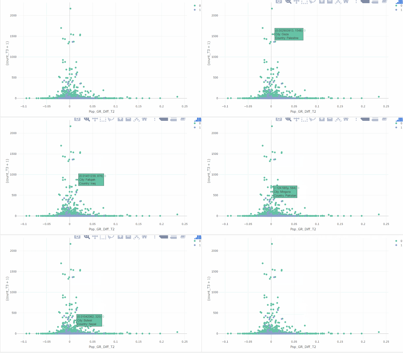
My frequency of update drops to almost once a week, which is not so good. I shall find more interesting topics to discuss. An interesting observation today is that cities with more conflicts close to it tend to be cities with population growth rates close to the national average of the country where the city is located. In my opinion, these cities simply get stuck in where they were. Since population associates strongly with city GDP, a city compromised by conflicts is associated with stagnant population and sluggish economic development. This figure below has the count of conflicts on the y-axis, and city population growth rate difference from national average (e.g. growth rate of New York minus the average growth rate of United States) on the x-axis for  4,231  cities. Green and blue dots represent cities in developing and developed countries respectively in around 2014. Using City GDP or GDP per capita shows a similar trend that cities with more conflicts ...

Boxplot can be viewed as vertical histogram

Image
Histogram is very informative but not intuitively easy to understand. It also makes reading boxplot difficult without understanding histogram. I will show the connection using average street width data that I am working on. Histogram is a barplot showing the frequency of the distribution. I ran into this very nice "human histogram" showing the distribution of students' heights: (google living histogram, there is another famous example by students at Berkley.) Figure 1. This is a great example also because the students were grouped by male and female, female (white) are generally lower in heights compared to male. The x-axis is the height of the student from 5 feet to 6 feet 5 inches. The y-axis is the counts of students (frequency) in each bin. We can easily see the distribution. The 5 feet 6 inches is the mode (most common number) of the heights. We can also get the median by counting the students. Now look at the average street width of 200 cities in year 1990:...

City population, growth rate, and income (GDP per capita)

Image
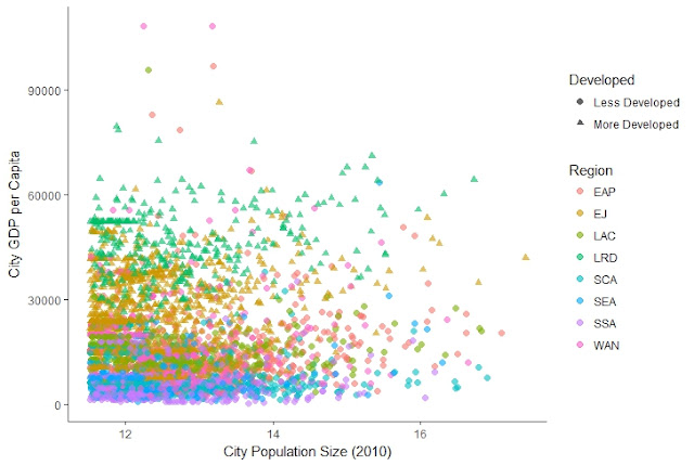
What the scatterplots can tell  These two scatterplots are messy at first glance, but the more I look at them the more stories I could see. Of course, maybe these findings can be illustrated separately in better ways. #1. City GDP per capita vs Log City Population Size City population has been put on log scale since it is too skewed. Without log (as in the 3D illustration below) all the cities are clustered on the left except the very large cities. The observations are: The first observation is that there is no pattern in the data points, meaning GDP per capita in the world correlates very weakly with the size of the city.  All the cities in the more developed regions (marked as triangles) are on the top. This is not surprising as the y-axis is income level (GDP per capita). What is interesting is that the distributions of population size for the developed region and developing region seem very close.  There is a natural stratification by the 8 ge...

More on the Zipf's Law and Gibrat's Law

Image
Since last Wednesday I have been updating the paper on the universe of cities. I have further simplified the statistical contents as statistics is usually confusing. It is a good learning for me, to focus on the findings, and make statistics simpler. Knowing that less is more, the restraint from lecturing statistics is something to be learned. It also occurred to me when rewriting the paper that the real findings are not that our data comply with the rank-size rule and proportionate growth mentioned in the last post, but rather, the data don't fit perfectly with these two regularities. The well-established rank-size rule describing city population size has its limit. It cannot fit the whole distribution if truncated at the lower end, as shown by Jan Eeckhout (2004). It cannot fit very large cities if pool the universe of cities together instead of looking into each country separately, as shown by our study. The power-law function is a mathematically simple and elegant model but...

The two most well-established regularity about city size

Image
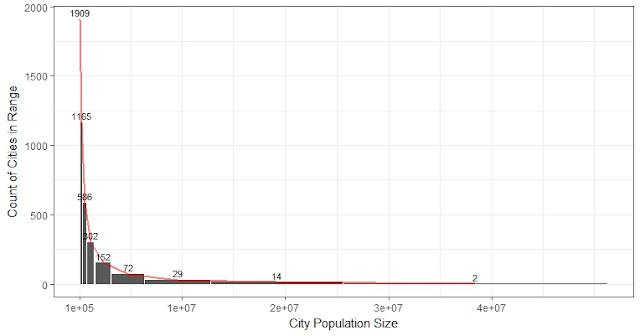
Yesterday I basically said a distribution that can satisfy Zipf's law is a Pareto distribution. I need to clarify that Zipf's law is not the same as power-law. Zipf's law simply relies on the fact that the slope in log-log rank-to-size is approximately 1. So the population size of a city is inversely proportional to the rank of the size of the city. For example, in the US, the tenth-ranked city, Detroit, should have a size of 1/10 of New York. Today I was reading a good paper by Jan Eeckhout (2004): "Gibrat's law for all cities". He fit the distribution on the US 2010 census data on 25,359 cities, towns and villages ranging from 1 to over 8 million in population, and show power-law only fit for cities larger than a certain lower boundary. The lognormal distribution would fit the entire population (fit means KS test doesn't reject with 5% significance level). The two fitted distribution are more similar when the size is over Exp(12), which is 160 thousand...

Power-law distribution (Pareto)& Zipf's Law: connection and how to fit the distribution of global city population

Image
- This post counts for 3 days. - In short,  We use the histogram to outline the distribution, use rank-frequency plot (log-log plot) to identify the power-law distribution, and use maximum likelihood estimation to obtain the parameters. -  I will show 1 st , how the power-law function CDF and PDF can be derived from Zipf CDF; and 2 nd , this least square estimation by excel is wrong and how to get the right one. Historical background on the power-law distribution. - Power-law distribution is as common as normal distribution in the real world. In the 19 th century, Italian economist Pareto realized that 20% of the population owns 80% the wealth, which is the famous 80/20 rule. He later named the power-law distribution as Pareto distribution, which is what we studied in the probability course. - In the 20 th century, another main contributor, Zipf made a similar discovery in linguistics about the frequency of words used. - Besides social wealth, many things fol...

The population sizes of the cities in the world follow the same distribution in the past 30 years

Image
This week has been busy. Since yesterday I have been working on the paper discussing the population size data of all the cities in the world. There are some very interesting findings and I can write several posts about it. One interesting finding is that contrary to some prevalent imagination that there are more and more large cities and the small cities are diminishing, our findings based on the population data of all the cities in the world since the year 1990 indicate such statement is wrong. More large cities do not necessarily imply fewer small cities. Thus, when there are more large cities, there are also more small cities proportionally. And since the total number of cities with size above 100 thousand is increasing, the share of small or large cities in the world remains the same.