Posts

Showing posts from January, 2018

The two most well-established regularity about city size

Image
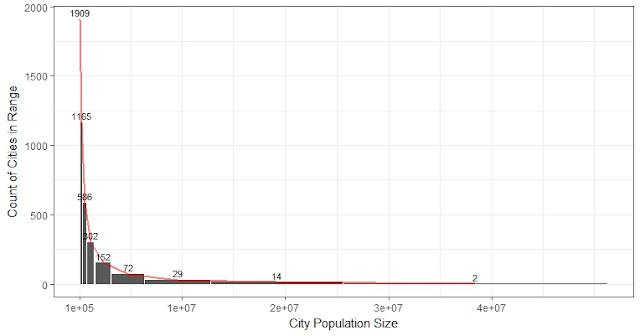
Yesterday I basically said a distribution that can satisfy Zipf's law is a Pareto distribution. I need to clarify that Zipf's law is not the same as power-law. Zipf's law simply relies on the fact that the slope in log-log rank-to-size is approximately 1. So the population size of a city is inversely proportional to the rank of the size of the city. For example, in the US, the tenth-ranked city, Detroit, should have a size of 1/10 of New York. Today I was reading a good paper by Jan Eeckhout (2004): "Gibrat's law for all cities". He fit the distribution on the US 2010 census data on 25,359 cities, towns and villages ranging from 1 to over 8 million in population, and show power-law only fit for cities larger than a certain lower boundary. The lognormal distribution would fit the entire population (fit means KS test doesn't reject with 5% significance level). The two fitted distribution are more similar when the size is over Exp(12), which is 160 thousand

Power-law distribution (Pareto)& Zipf's Law: connection and how to fit the distribution of global city population

Image
- This post counts for 3 days. - In short,  We use the histogram to outline the distribution, use rank-frequency plot (log-log plot) to identify the power-law distribution, and use maximum likelihood estimation to obtain the parameters. -  I will show 1 st , how the power-law function CDF and PDF can be derived from Zipf CDF; and 2 nd , this least square estimation by excel is wrong and how to get the right one. Historical background on the power-law distribution. - Power-law distribution is as common as normal distribution in the real world. In the 19 th century, Italian economist Pareto realized that 20% of the population owns 80% the wealth, which is the famous 80/20 rule. He later named the power-law distribution as Pareto distribution, which is what we studied in the probability course. - In the 20 th century, another main contributor, Zipf made a similar discovery in linguistics about the frequency of words used. - Besides social wealth, many things follow a hig

The population sizes of the cities in the world follow the same distribution in the past 30 years

Image
This week has been busy. Since yesterday I have been working on the paper discussing the population size data of all the cities in the world. There are some very interesting findings and I can write several posts about it. One interesting finding is that contrary to some prevalent imagination that there are more and more large cities and the small cities are diminishing, our findings based on the population data of all the cities in the world since the year 1990 indicate such statement is wrong. More large cities do not necessarily imply fewer small cities. Thus, when there are more large cities, there are also more small cities proportionally. And since the total number of cities with size above 100 thousand is increasing, the share of small or large cities in the world remains the same.

How I mapped the city-level GDP from MGI dataset into the universe of cities

One of the main exercises I did during the late year 2017 was to create city-level GDP for the 4231 "universe" of cities. There were lots of interesting problems encountered during the process. The main reference dataset is McKinsey Global Institute (MGI)'s Cityscope database of 2910 cities. They have city GDP and population, and they highly correlate with each other. I guess regression was already applied in obtaining their city GDP data. My own guideline on this task is to rely on MGI data as much as I can. The 1st step was to match cities directly.  I first matched by city name and country, then matched those within 20km geological distance.  Because not surprising, there are no common code or city names. Even the country name can be different and sometimes MGI's geological coordinations are wrong. There are 2617 (62%) cities matched directly by MGI data. Then linear regressions within each country using MGI city population as the independent variable to fit

How to manually change the order of legend and plot means and error bars

Image
It is a good practice to let the legend follow the trend of the data. Like in the figure below, the legend is also ordered from "Top 20" to "Bottom 80%". Another example in which the legend is ordered from high to low by the values in 2010: The rest are technical notes. Depends on how to code is organized in ggplot2, there are different ways to change the order: 1. Sometimes just reorder the levels of the factor is enoug h: # reorder the factor m4_mean_all_2$Group <- factor(m4_mean_all_2$Group, levels =c( 'Top 20%' , 'In Total' , 'Bottom 80%' )) # plot the top20 by group ggplot(data=m4_mean_all_2, aes(x=year, y=wm, group=Group, color=Group, shape=Group))+ geom_point(size= 4 )+ geom_line(size= 1 )+ geom_errorbar(aes(ymin=CI_low, ymax=CI_high), width= .2 )+ ggtitle( "Urban Density Change Over Time in Colombia" ) + labs(x= "Year" , y= &

Interesting findings on weights

Image
Assume I have several variables to study from the sample, should we apply same or different weight? When will the weights be helpful to make the sample mean closer to the population mean? Are some weights more helpful than others depending on the nature of the variable? Our case is especially confusing, because different from a common study, the subject is not an individual, but a city! Most variables are city-based: city area, block size, etc. But each city has its own population size, and some variables are individual-based: like GDP per capita. GDP per capita is measured by the city, but its nature is an individual-level variable. We should treat them differently.  Our data have offered a great opportunity to test these questions. We have a sample of 200 cities for which we have measured more than a hundred variables. These 200 samples were drawn from the 4231 global cities (named as the universe of cities ), which is the real population of the sample. We happen to have se

Why a perfect correlation can mean nothing: intuition behind correlation

Image
Besides attending a meeting in the morning discussing the Colombia paper, I have read some interesting stuff about correlation. When we talk about correlation, in most cases we mean "linear correlation". What is a linear correlation? Let's look at two cases where there is no linear correlation (the correlation coefficient is 0 ). In the first case, the two variables follow a quadratic function, a parabole, and the correlation is zero. In the second case, the fitted line can go through (2,2) from any direction so there is no way to fit a certain line. Actually, the correlation is zero as long as the scatterplot is symmetrical by either horizontal or vertical line. In sum, the strength of the correlation only describes how well the linear model can describe the relationship, or how well a straight line can get closer to all the points. A linear model is relatively easy to interpret and can work well in many real-world cases, but there is no guarantee for it to

Fix a minor issue calculating geological distance when acos produces NaN

Image
As well as how the distances between geological points were calculated Calculating the distance between two points on the earth is fundamental to calculate all the measurements mentioned in earlier posts. The distance in kilometers is calculated using the  Spherical Law of Cosines : d = acos( sin(lat1)*sin(lat2) + cos(lat1)* cos (lat2)* cos (long2-long1) )  * 6371 (km) Step-by-step explanation: The sin and cos functions take latitudes and longitudes input in radians in most softwares.  For example, Shanghai has a coordination of ( 31.222, 121.458 ), its (lat1, long1) in radians is ( 31.222/180 * pi, 121.458/180 * pi) = (0.55, 2.12), pi = 3.14159... The coordination for New York is (40.717, -74.004), in radian: (0.71, -1.29). sin(lat1)* sin (lat2) +  cos (lat1)* cos (lat2)* cos (long2-long1)  =  sin ( 0.55 )* sin ( 0.71 ) +  cos ( 0.55 )* cos ( 0.71 )* cos (-1.29 - 2.12) = -0.28  ---> this output is a value from -1 to 1 The angle AOB formed by A (Shanghai),  O (Center of

Why it is so wrong to average ratios: Simpson's paradox

Image
As a statistics major, I haven't fully appreciated the wonder of Simpson's paradox until I run through real problems in practice. Simpson's paradox is mentioned at the beginning of most introductory statistics books. Basically, it says (according to wiki) a trend that appears in several different groups of data might disappear or even reverse when these groups are combined. If all the cities in a country have higher GDP per capita after 10 years, does it mean that the country as a whole has higher GDP per capita? If a treatment is better (higher success rate) for both group A patients and group B patients, does it mean this treatment is better for group A and B combined? If the profit-to-income ratio is higher for every product for company A compared to company B, does it mean company A has higher profit-to-income?  The answer is "not necessarily". And for the same reason, it is meaningless to take an unweighted average for a ratio measurement.

Redo Airport Score

Image
This morning I have redone everything mentioned in the  post 1/8 . The last version used an air route dataset of 37,595 records, turned out to be an earlier version. The latest version has 67,240 records. As a quick reminder, "airport score" is a measurement created based on global airport network. It shows how centered each city is in the global air traffic network. In short, the airport score for each point on earth (or each city) is the sum product of airport weights and inverse distances to the point from all the airports. The airport weights are obtained through eigenvector centrality using a dataset of all the airline linkages in the world. Method 1. There are 3,300 airports in total, for each city, calculate the distances  x to each airport, apply an inverse function of the distance f(x) = 1/(1+x)^p to penalize airports that are further away. Different values of the exponent (p) would produce quite different ranking results. I chose p to be 200 through parameter

Visualization of Conflicts in Colombia and the World

Image
The Uppsala Conflict Data Program (UCDP) has recorded ongoing violent conflicts since the 1970s. Using its dataset of 135 thousand records of organized violence globally since 1989, we can evaluate the distribution of conflicts in the world and in specific countries. I listed here the top 10 countries: Order Country Freq 1 Afghanistan 22,726 2 India 14,465 3 Iraq 6,488 4 Nepal 5,652 5 Pakistan 5,528 6 Turkey 4,826 7 Sri Lanka 4,576 8 Colombia 4,562 9 Algeria 4,098 10 Somalia 4,090 Since the year 2000, there are 98K records in the dataset. Again, the top 10 are: Country Freq 1 Afghanistan 20,980 2 India 11,409 3 Iraq 6,109 4 Pakistan 5,335 5 Nepal 5,084 6 Somalia 3,664 7 Colombia 3,302 8 Russia  3,115 9 Nigeria 2,901 10

3D World Map: Air Connectivity

Image
(Today all my team members were in office since the boss said he should be back today. He did not show up. But I am glad to see everyone in the new year!) "Airport score" is a measurement created based on global airport network. It shows how centered each city is in the global air traffic network. In short, the airport score for each point on earth (or each city) is the sum product of airport weights and inverse distances to the point from all the airports. The airport weights are obtained through eigenvector centrality using a dataset of all the airline linkages in the world. I have already calculated all the scores but I was thinking over the new year how to visualize them. It turns out not so difficult: I googled "3D world map in R" this morning and found an interesting blog by  Mohit Singh , which I borrowed a lot.  3D world map can be done by the globejs  function  from R package   threejs .  The function can plot both points and arcs in the same time.