Power-law distribution (Pareto)& Zipf's Law: connection and how to fit the distribution of global city population
- This post counts for 3 days.
- In short, We use the histogram to outline the distribution, use rank-frequency plot (log-log plot) to identify the power-law distribution, and use maximum likelihood estimation to obtain the parameters.
- I will show 1st, how the power-law function CDF and PDF can be derived from Zipf CDF; and 2nd, this least square estimation by excel is wrong and how to get the right one.
Historical background on the power-law distribution.
- Power-law distribution is as common as normal distribution in the real world. In the 19th century, Italian economist Pareto realized that 20% of the population owns 80% the wealth, which is the famous 80/20 rule. He later named the power-law distribution as Pareto distribution, which is what we studied in the probability course.
- In the 20th century, another main contributor, Zipf made a similar discovery in linguistics about the frequency of words used.
- Besides social wealth, many things follow a highly skewed distribution: GDP, Income, sales of books, webpage visits, and of course, the population of cities.
- This blog That’s Just Not Normal summarizes that phenomena following a power law distribution are driven by the following dynamics:
- Lack of natural bounding constraints to inhibit geometric growth
- Significant growth over time leading to very large ranges of values
- Inter-connectivity, dependency or relationships between items (typically described as a network effect)
- Related to highly dynamic, complex systems
- What really interests me is that a mathematical simple and elegant formula can model so many things so well. It is indeed, much easier to write down than a normal distribution.
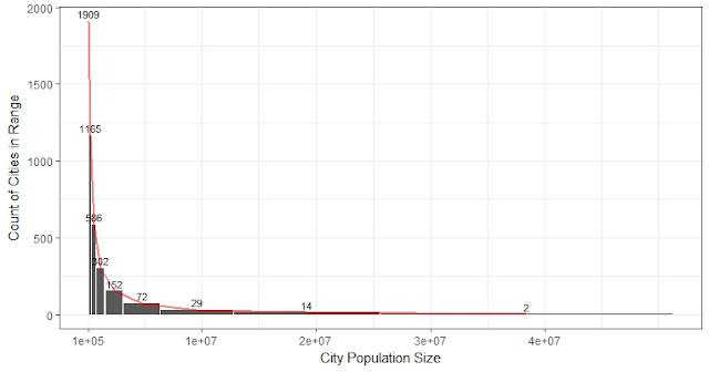
The histogram shows the distribution of world population fitted with power-law distribution
The Zipf’s law plots the populations against the ranks of the cities, with the largest population ranking at the top, and the horizontal line is the index (Rank). It can be plot and fitted with a power function easily in excel (Left). And if both axes are on the logarithmic scale, a power function and fit most of the cities (90% of the cities are on the dotted line) except the very large ones. It gives a slope of -0.941. Later we will show the right value from MLE should be -1.054. Since there are so many slopes here depending on how the graph is plotted, it's easy to get a wrong number that sounds close to others right result. So let's make sure we are comparing the same slope.
1. Why “Zipf CDF” is just a mathematical variant of the power-law (Pareto) distribution
Let's flip the x-axis and y-axis of Zipf CDF and divide the rank by the total number of cities (below left).
Thus, the figure above (up-left) is called the complementary cumulative density function (CCDF). And if we flip it up-side-down (up-right), we have obtained the cumulative density function (CDF) of city populations.
If we put both axes on log scales and fit a power function in excel, we can obtain the (wrongly estimated) slope for the power-law CCDF:
2. Calculate the right power-law distribution
The up-right plot shows the wrong formula for CCDF fit by excel. It gives a slope of -1.052, while the right one should be -0.949.
As mentioned earlier, let X represents the random variable that describes the population size of a city. The probability density function (PDF) as shown by the histogram is. Take the logarithm on both sides, it is a straight line with slope -a and intercept logC:
And it is pretty biased. Moreover, it is easy to confuse the excel slope for CCDF (Rank vs. Population), which is -1.052, with the correct slope for Zipf CDF (Population vs. Rank), which is -1.054, and think the results are close. The results are very different if we compare the same slope.
The empirical PDF, CDF, CCDF, and Zipf CDF with the calculated fitted lines in red:
The fitting of the power-law function is not as bad as it looks. Recall that there are only 117 cities in the 4231 (2.8%) with a population larger than 1E6.5
There are other options like Weibull and Lognormal distributions. It seems lognormal can fit the large cities better. When I tried before, one-sample Kolmogorov-Smirnov test always rejects the null hypothesis for any fitted models. But it seems that power function still performs relatively acceptable. And it is mathematically simple.


Comments