Posts

Showing posts with the label 3D Map

Visualization of work/home density and get a good heat map

Image
Show the distribution of jobs and homes Technical discussion on how to apply the heatmap properly R code (Revise on 4/1, on the Friday meeting, a colleague (Xinyue) reminded me a better way to handle the heat map. By taking the log of a highly skewed value the heatmap looks much better) The distribution of homes and jobs in Chicago It is an interesting idea to map both home and job density on the same map. The job locations are more concentrated, especially so in the city center. The 2km x 2km block with most jobs is 13 times the height of the block with most homes. (474 k vs. 37 k). The 2km x 2km block with most jobs contains 13% of the total jobs, while the one with most homes contains only 1% of all the homes. Distribution of Jobs: if use heatmap : of homes: if use heatmap: In animation: Technical discussion on heatmap: The jobs are more concentrated in the city center than homes. When the distribution is highly skewed the ...

Redo Airport Score

Image
This morning I have redone everything mentioned in the  post 1/8 . The last version used an air route dataset of 37,595 records, turned out to be an earlier version. The latest version has 67,240 records. As a quick reminder, "airport score" is a measurement created based on global airport network. It shows how centered each city is in the global air traffic network. In short, the airport score for each point on earth (or each city) is the sum product of airport weights and inverse distances to the point from all the airports. The airport weights are obtained through eigenvector centrality using a dataset of all the airline linkages in the world. Method 1. There are 3,300 airports in total, for each city, calculate the distances  x to each airport, apply an inverse function of the distance f(x) = 1/(1+x)^p to penalize airports that are further away. Different values of the exponent (p) would produce quite different ranking results. I chose p to be 200 through ...

Visualization of Conflicts in Colombia and the World

Image
The Uppsala Conflict Data Program (UCDP) has recorded ongoing violent conflicts since the 1970s. Using its dataset of 135 thousand records of organized violence globally since 1989, we can evaluate the distribution of conflicts in the world and in specific countries. I listed here the top 10 countries: Order Country Freq 1 Afghanistan 22,726 2 India 14,465 3 Iraq 6,488 4 Nepal 5,652 5 Pakistan 5,528 6 Turkey 4,826 7 Sri Lanka 4,576 8 Colombia 4,562 9 Algeria 4,098 10 Somalia 4,090 Since the year 2000, there are 98K records in the dataset. Again, the top 10 are: Country Freq 1 Afghanistan 20,980 2 India 11,409 3 Iraq 6,109 4 Pakistan 5,335 5 Nepal 5,084 6 Somalia 3,664 7 Colombia 3,302 8 Russia  3,115 9 Nigeria 2,901 ...

3D World Map: Air Connectivity

Image
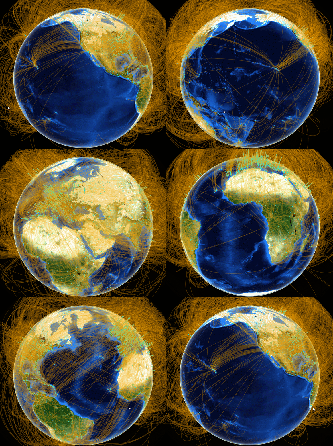
(Today all my team members were in office since the boss said he should be back today. He did not show up. But I am glad to see everyone in the new year!) "Airport score" is a measurement created based on global airport network. It shows how centered each city is in the global air traffic network. In short, the airport score for each point on earth (or each city) is the sum product of airport weights and inverse distances to the point from all the airports. The airport weights are obtained through eigenvector centrality using a dataset of all the airline linkages in the world. I have already calculated all the scores but I was thinking over the new year how to visualize them. It turns out not so difficult: I googled "3D world map in R" this morning and found an interesting blog by  Mohit Singh , which I borrowed a lot.  3D world map can be done by the globejs  function  from R package   threejs .  The function can plot both points and arcs in the sa...