Visualization of work/home density and get a good heat map
- Show the distribution of jobs and homes
- Technical discussion on how to apply the heatmap properly
- R code
(Revise on 4/1, on the Friday meeting, a colleague (Xinyue) reminded me a better way to handle the heat map. By taking the log of a highly skewed value the heatmap looks much better)The distribution of homes and jobs in Chicago
It is an interesting idea to map both home and job density on the same map. The job locations are more concentrated, especially so in the city center.The 2km x 2km block with most jobs is 13 times the height of the block with most homes. (474 k vs. 37 k).
The 2km x 2km block with most jobs contains 13% of the total jobs, while the one with most homes contains only 1% of all the homes.
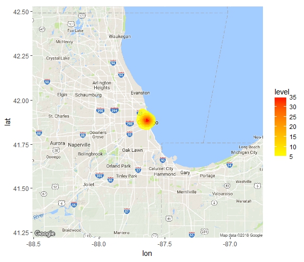
Distribution of Jobs:

if use heatmap :
of homes:

if use heatmap:

In animation:


Technical discussion on heatmap:
The jobs are more concentrated in the city center than homes. When the distribution is highly skewed the heatmap cannot show the gradient with enough distinguishability.In R, ggplot2 has a function cut_number that makes n groups with (approximately) equal numbers of observations. Thus, if n = 4, the intervals are actually Q1, median and Q3.
Work and home density by groups of equal number, the work (top) map should be more concentrated.
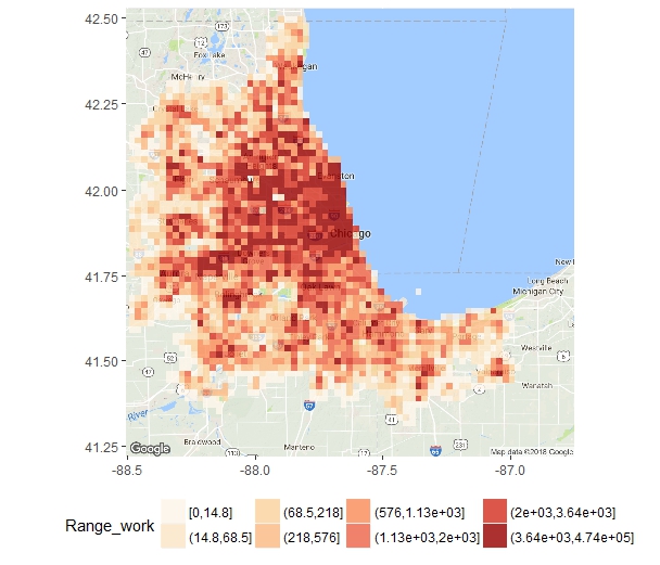


A better solution is to take log of the results, and align the color scale for the two figures:
The scale is based on the number of jobs, which has higher largest value. RColorBrewer is a nice package that can output color scale from the color brewer.


If we don't take log such comparison won't be possible.
The R code:
## take log and cut the variable into groups
breaks_of_interval <- seq(0, max(log(whBlock$workCount)),
                          length.out=7)
whBlock$Range_log_work <- cut(log(whBlock$workCount), breaks = breaks_of_interval)
whBlock$Range_log_home <- cut(log(whBlock$homeCount), breaks = breaks_of_interval)

## find the manual color ##
library("RColorBrewer")
display.brewer.pal(n = 8, name = 'OrRd')
color_scale <- brewer.pal(n = 8, name = "OrRd")[3:8]

# where the people live
ggmap(chicago_map) +
  geom_tile(data = whBlock, aes(x = long, y = lat, fill = Range_log_home), alpha = 0.8)+
  scale_fill_manual(values = color_scale)+
  theme(legend.position = 'bottom',
        axis.title.y = element_blank(), axis.title.x = element_blank())
# where the people work
ggmap(chicago_map) +
  geom_tile(data = whBlock, aes(x = long, y = lat, fill = Range_log_work), alpha = 0.8)+
  scale_fill_manual(values = color_scale)+
  theme(legend.position = 'bottom',
        axis.title.y = element_blank(), axis.title.x = element_blank())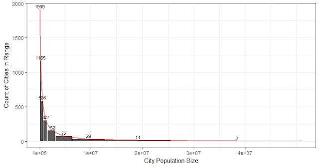


Comments