Boxplot can be viewed as vertical histogram
Histogram is very informative but not intuitively easy to understand. It also makes reading boxplot difficult without understanding histogram. I will show the connection using average street width data that I am working on.
Histogram is a barplot showing the frequency of the distribution. I ran into this very nice "human histogram" showing the distribution of students' heights: (google living histogram, there is another famous example by students at Berkley.)
Figure 1.

This is a great example also because the students were grouped by male and female, female (white) are generally lower in heights compared to male. The x-axis is the height of the student from 5 feet to 6 feet 5 inches. The y-axis is the counts of students (frequency) in each bin. We can easily see the distribution. The 5 feet 6 inches is the mode (most common number) of the heights. We can also get the median by counting the students.
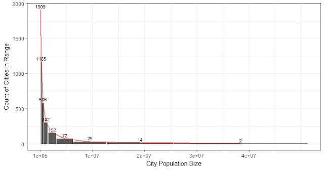
Now look at the average street width of 200 cities in year 1990:
Figure 2. Histogram of average street width: this histogram has 15 bins.

Most cities have an average street width in the range of 8 to 11 meters. So the histogram has the highest frequency (counts) around 8. A boxplot below the histogram can show almost all these information using a box and two whiskers. The median of the distribution is 8.7, which is shown by the line in the middle of the box. Dots are outlier cities beyond 1.5 IQR (IQR: Interquartile range is the difference between Q1 and Q3, helps to refresh my memory too).
Usually, boxplot is plot vertically. So every box and whiskers show a distribution:
Figure 3.

Since we have the data of shares of streets by 5 bins (<4m, 4-8m, ...,etc), we naturally have a histogram of street width with 5 bins (Figure 3) instead of 15 (Figure 2). Moreover, within each bin, there is a distribution composed of 200 cities within certain width rage, in each time period. Notice that the overall shape of Figure 3 is the same as Figure 2 as they are just histograms with different bins.
Histogram is a barplot showing the frequency of the distribution. I ran into this very nice "human histogram" showing the distribution of students' heights: (google living histogram, there is another famous example by students at Berkley.)
Figure 1.

This is a great example also because the students were grouped by male and female, female (white) are generally lower in heights compared to male. The x-axis is the height of the student from 5 feet to 6 feet 5 inches. The y-axis is the counts of students (frequency) in each bin. We can easily see the distribution. The 5 feet 6 inches is the mode (most common number) of the heights. We can also get the median by counting the students.
Now look at the average street width of 200 cities in year 1990:
Figure 2. Histogram of average street width: this histogram has 15 bins.

Most cities have an average street width in the range of 8 to 11 meters. So the histogram has the highest frequency (counts) around 8. A boxplot below the histogram can show almost all these information using a box and two whiskers. The median of the distribution is 8.7, which is shown by the line in the middle of the box. Dots are outlier cities beyond 1.5 IQR (IQR: Interquartile range is the difference between Q1 and Q3, helps to refresh my memory too).
Usually, boxplot is plot vertically. So every box and whiskers show a distribution:
Figure 3.

Since we have the data of shares of streets by 5 bins (<4m, 4-8m, ...,etc), we naturally have a histogram of street width with 5 bins (Figure 3) instead of 15 (Figure 2). Moreover, within each bin, there is a distribution composed of 200 cities within certain width rage, in each time period. Notice that the overall shape of Figure 3 is the same as Figure 2 as they are just histograms with different bins.


Comments