Visualization of commuting connections in Chicago
Following the last post, naturally, we would like to observe these 3.5 million connections directly. But even with 35k connections, the lines can fill the whole map. It makes more sense to show randomly sampled connections while we have checked that the sample is pretty representative of the parent distribution.
This post includes the R code in the end.
Fig 1. 35 K trips (1% of the 3.5 M), shorter trips marked in red and longer trips marked in yellow.
(If mark longer trips with the darker color they would cover everything beneath. )

Fig 2. Use only 3.5 k trips (1/10 of fig 1), red color shows shorter trips.

Fig 3. Use only 3.5 k trips, but shorter trips are less transparent (higher alpha value)
The less transparent (longer) trips can hardly be identified since there are too many short trips covering on top.

The relative density of where do people live:

And where do people work:

Job opportunities are relatively more concentrated in the center than locations of homes.
Example by Nathan Yau
More ggmap examples
My earlier post on global air connections
But to show connections within a city, using bezier curve is not necessary because directly line can serve the purpose well enough in such a small area. And the for loop written by Nathan Yau might encounter a problem when the number of lines increases. To plot thousands of lines onto a map. First use reshape to transpose the original [home_long, home_lat, work_long, work_lat] data frame from wide into long format: [long, lat], but grouped by each home - destination pairs. So for N = 35k, there are 35k groups: [1,1, 2,2, 3,3, .... , 35k, 35k]. Then use ggmap and ggplot to add lines by the groups.

As a comparison, using bezier curves by adopting code from Nathan Yau shows a similar result:
I discussed heat map (and code) in the next post.
The code for 3d surface map:

This post includes the R code in the end.
Connection Map
The main observation is that shorter trips are more clustered near the city center.Fig 1. 35 K trips (1% of the 3.5 M), shorter trips marked in red and longer trips marked in yellow.
(If mark longer trips with the darker color they would cover everything beneath. )
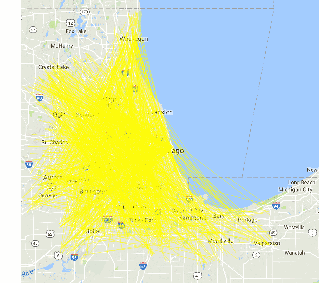
Fig 2. Use only 3.5 k trips (1/10 of fig 1), red color shows shorter trips.

Fig 3. Use only 3.5 k trips, but shorter trips are less transparent (higher alpha value)
The less transparent (longer) trips can hardly be identified since there are too many short trips covering on top.

Density Map
The relative density of where do people live:
And where do people work:

Job opportunities are relatively more concentrated in the center than locations of homes.
Method
Some nice examples online use bezier curves to show air connections in the United States or in the world:Example by Nathan Yau
More ggmap examples
My earlier post on global air connections
# first, sort data set by travel distances (DisTravel) from long to short, then assign groups to each observation (a home - work cooridnate pair). So later longer trips will be assigned a deeper red color.
test <- test[order(test$DisTravel, decreasing = T),]
n_row <- nrow(test)
test$group <- 1:n_row

# create a color scale of 100 colors to all the groups:
# long distance (yellow) -> short distance (red)
pal <- colorRampPalette(c("yellow", "red"))
colors <- pal(100)
colors_panel <- colors[ceiling(test$group/n_row*length(colors))]

# use reshape to convert from wide to long
test_long <- reshape(test, direction = 'long',
                     varying = list(
                       c('h_cen_long', 'w_cen_long'),
                       c('h_cen_lat', 'w_cen_lat')
                     ),
                     timevar = 'location',
                     times = c('home','work'),
                     v.names = c('long', 'lat')
)

library(ggmap)
library(ggplot2)
chicago_map <- get_map(location = 'chicago_map', zoom = 9)

# add lines with manual color, remove legend:
ggmap(chicago_map)+
  geom_line(data = test_long,  alpha = 0.2, lwd = 0.5,
            aes(x=long, y=lat, group=group, color=factor(group))) +
  scale_color_manual(values=colors_panel) +
  theme(legend.position="none",
        axis.title.y = element_blank(), axis.title.x = element_blank())
###
As a comparison, using bezier curves by adopting code from Nathan Yau shows a similar result:
I discussed heat map (and code) in the next post.
The code for 3d surface map:

# For 3d surface, the dataset has 3 variables: Measurement, long, lat.
library("lattice")
# A single figure example for testing:
wireframe(DisTravel ~ long * lat, data = homeBlock2,
          main = "Average Distance Travelled by Home Block",
          zlab = "Distance (km)",
          drape = TRUE, # add color
          colorkey = F, # add color key
          pretty=T,     # not so useful in this case
          # adjust how to view the screen
          screen = list(z = -80, x = -60), alpha = 0.6
)

# Draw two figures in one frame:
par.set <- list(axis.line = list(col = "transparent"),
           clip = list(panel = "off"))
# Ave Distance travelled by home block
print(wireframe(DisTravel ~ long * lat, data = homeBlock2,
                main = "Distance Travelled by Where People Live",
                zlab = "Distance (km)",
                drape = TRUE, colorkey = TRUE,
                screen = list(z = 0, x = -60),
                par.settings = par.set
                ),
      split = c(1,1,2,1), more = TRUE)
print(wireframe(DisTravel ~ long * lat, data = homeBlock2,
                zlab = "Distance (km)",
                drape = TRUE, colorkey = TRUE,
                screen = list(z = -80, x = -60),
                par.settings = par.set
                ),
      split = c(2,1,2,1))


Comments