The revise of figures (and paper) has no end
Here I show one of the figures, the current version vs. the original one.
Figure. Change of median city population sizes from 1990 to 2010, the legend is sorted by median population from high to low in 1990.
The current version
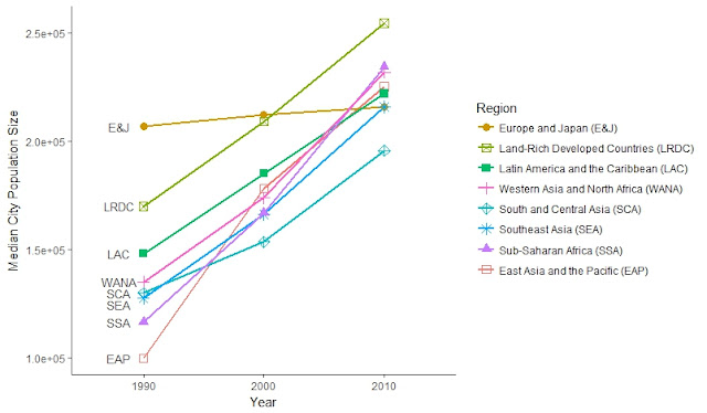

Figure. Change of median city population sizes from 1990 to 2010, the legend is sorted by median population from high to low in 1990.
The current version

The old version

- I have let the order of the legend follow the order in the plot
- Add annotations to the plot directly so the audiance don't have to cross-check the legend on the right
- By default, ggplot only use 6 shapes, so I have to manually add 2 shapes.
- Revise the axis scale


Comments