Posts

Showing posts from March, 2018

Visualization of work/home density and get a good heat map

Image
Show the distribution of jobs and homes Technical discussion on how to apply the heatmap properly R code (Revise on 4/1, on the Friday meeting, a colleague (Xinyue) reminded me a better way to handle the heat map. By taking the log of a highly skewed value the heatmap looks much better) The distribution of homes and jobs in Chicago It is an interesting idea to map both home and job density on the same map. The job locations are more concentrated, especially so in the city center. The 2km x 2km block with most jobs is 13 times the height of the block with most homes. (474 k vs. 37 k). The 2km x 2km block with most jobs contains 13% of the total jobs, while the one with most homes contains only 1% of all the homes. Distribution of Jobs: if use heatmap : of homes: if use heatmap: In animation: Technical discussion on heatmap: The jobs are more concentrated in the city center than homes. When the distribution is highly skewed the ...

Visualization of commuting connections in Chicago

Image
Following the last post, naturally, we would like to observe these 3.5 million connections directly. But even with 35k connections, the lines can fill the whole map. It makes more sense to show randomly sampled connections while we have checked that the sample is pretty representative of the parent distribution. This post includes the R code in the end. Connection Map The main observation is that shorter trips are more clustered near the city center. Fig 1. 35 K trips (1% of the 3.5 M), shorter trips marked in red and longer trips marked in yellow. (If mark longer trips with the darker color they would cover everything beneath. ) Fig 2. Use only 3.5 k trips (1/10 of fig 1), red color shows shorter trips. Fig 3. Use only 3.5 k trips, but shorter trips are less transparent (higher alpha value) The less transparent (longer) trips can hardly be identified since there are too many short trips covering on top. Density Map The relative density of where do people live...

Week 3/19 How many jobs are passed on the way in Chicago?

Image
Revised on Mar.25th, calculation of jobs passed was not correct. 3.21 - 23 (Fri) Since Wednesday I have been working on a problem that looks similar to the global conflict score I calculated before. We have the coordinates of both start points (home) and end poi nts (work) of 3.5 million commuting trips in Chicago. One trip can carry more than one person, the total number of people on all the trips is 3.7 million. So each trip is weighted, but the average number of persons on each trip is merely 1.07. 1. Most trips in the dataset were done by only one person The distribution of the weights: number of people on each trip between each pair of origin and destination are highly skewed to the right: the busiest trip had 109 persons traveling from Indian Village to the University of Chicago. Actually, the top 13 trips (853 persons) all target somewhere in the University of Chicago (coordinate: 41.78937, -87.60285). On the other hand, 95% of the 3.5 million trips have only 1 person...

Poll: Which figure is better? The bars or the points

Image
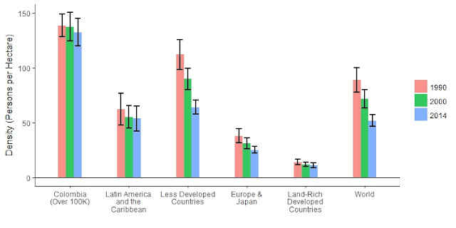
I have two figures that show the same information: means of density by region across three time periods. Figure 1 group by region, use a bar chart. Figure 2 group by year, use scatterplot. Poll: Which Figure is better? Figure 1.  Figure 2. 

Conflicts occur in stagnant places

Image
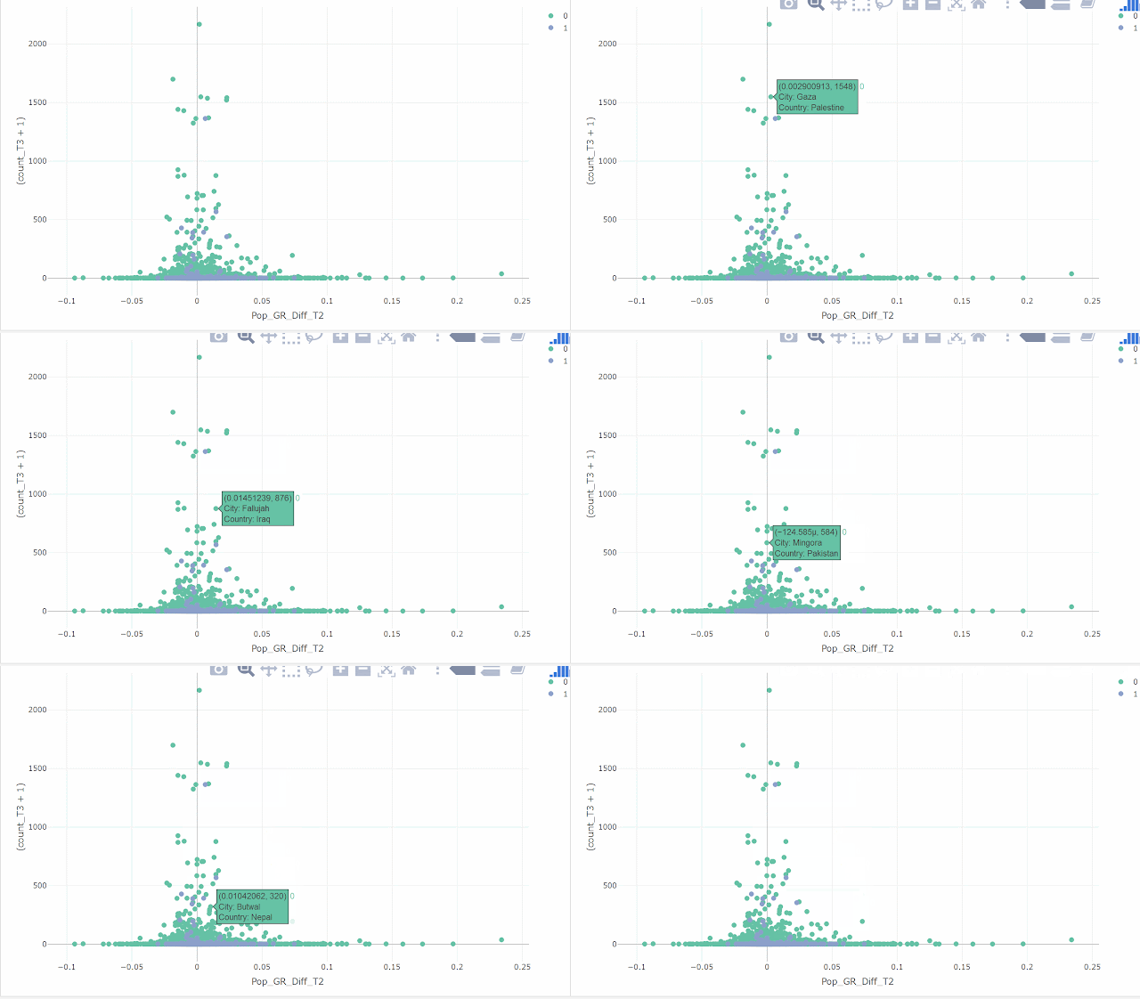
My frequency of update drops to almost once a week, which is not so good. I shall find more interesting topics to discuss. An interesting observation today is that cities with more conflicts close to it tend to be cities with population growth rates close to the national average of the country where the city is located. In my opinion, these cities simply get stuck in where they were. Since population associates strongly with city GDP, a city compromised by conflicts is associated with stagnant population and sluggish economic development. This figure below has the count of conflicts on the y-axis, and city population growth rate difference from national average (e.g. growth rate of New York minus the average growth rate of United States) on the x-axis for  4,231  cities. Green and blue dots represent cities in developing and developed countries respectively in around 2014. Using City GDP or GDP per capita shows a similar trend that cities with more conflicts ...

Boxplot can be viewed as vertical histogram

Image
Histogram is very informative but not intuitively easy to understand. It also makes reading boxplot difficult without understanding histogram. I will show the connection using average street width data that I am working on. Histogram is a barplot showing the frequency of the distribution. I ran into this very nice "human histogram" showing the distribution of students' heights: (google living histogram, there is another famous example by students at Berkley.) Figure 1. This is a great example also because the students were grouped by male and female, female (white) are generally lower in heights compared to male. The x-axis is the height of the student from 5 feet to 6 feet 5 inches. The y-axis is the counts of students (frequency) in each bin. We can easily see the distribution. The 5 feet 6 inches is the mode (most common number) of the heights. We can also get the median by counting the students. Now look at the average street width of 200 cities in year 1990:...